Wednesday, December 16, 2009

Conclusion (Probably…) and a Thank You

One week ago today, I finished the last final of the first quarter of my freshman year in college (1). However, based on the amount of time I have spent not continuing to blog since then (2), I am formally announcing that this is my final blog. Probably. For right now.

This is not because I lack ideas to write about, or because design has suddenly stopped being a major component of modern society. It is definitely not because of you, my loyal supporters and friends (3). It is because I have suddenly found other priorities (4), chief among them, revisiting old buddies from school, hanging out with my family, sleeping, shopping for holiday gifts, and skiing (5, and Image).

Despite these newfound priorities, I might find it necessary to blog for another class. Or perhaps I might send in the occasional blog because I see something that deserves extra attention. I guess what I’m trying to say is: Don’t delete me from your favorites just yet; check back every couple of months to see what’s up.

No matter what happens, I’d like to thank all of you who took the time out of your day to read my blog, and I hope it made you laugh (6): Thank you.

(1) The final for the class I’m blogging (blogged, I guess) for, Introduction to Design, was on Monday.
(2) About 168 hours since Wednesday.
(3) And the occasional drop in…
(4) Like a life.
(5) Nordic skiing aka Cross Country skiing. Because I’m a badass. If you don’t know what I’m talking about, look it up, or look at the picture.
(6) Or chuckle. Or smile. Or at least grin a little bit “on the inside.”

P.S.
Sorry that there’s no actual content about Design in Society this time. Maybe next time, when you check back in a couple months…


Image: http://www.odt.co.nz/files/story/2009/08/competing_in_the_sprint_cross_country_men_s_final__6124449404.JPG

Saturday, November 21, 2009

Fire Alarms

Where I live, we just recently had our seventh fire alarm (1) pulled in the past two months (2). So at four in the morning, when I was deciding if it was a prank or real and whether or not I needed to get out of bed (3), I thought to myself, “What could possibly make people want to pull the fire alarm so badly? And who the heck (4) would design such a terrible torture device?” The alarm turned out to be because of the faulty kitchen in the common area, again, but the questions stuck with me.

My guess for the first question is that the clearly printed words, “Pull Down” or “Push In, Pull Down,” working in conjunction with the color red, and the big, downward pointing arrows, have something to do with it (see images). Then again, it might be that tendency for kids in my age demographic to be self-destructive. As a good friend asked me last year, “Have you ever been driving and wanted to suddenly turn into the other lane (the one with oncoming traffic) as a car is coming?”

As for the second question, “Who designed the fire alarm?” the answer is Francis Robbins Upton, who did it in 1890 (5). It was not until the 1930s, though, that the smoke detector was (accidentally) invented by Walter Jaeger; smoke detectors and fire alarms tend to go hand in hand. By the late 1960s, fire alarms/smoke detectors were out on the commercial market, and are now present in about 93% of US homes and you are reportedly twice as likely to survive a house fire if you have one (same site as 5). I appreciate that fire alarms are here to save my life, but could they please do it sometime other than 4am?

(1) It might actually be eighth. My roommates and I are keeping a tally, but there’s a chance we all were gone when one happened.
(2) Yes, I do live in the dorms.
(3) You tend to get a bit jaded…
(4) You’re right…”heck” was not the word I was thinking at 4 in the am.
(5) I browsed the net for 20 minutes and his was the name that appeared most frequently. I would’ve preferred to use a book source, but alas, I have no books about fire alarms handy. Here’s the most helpful page: http://en.wikipedia.org/wiki/Smoke_detector

Top Fire Alarm Pull: http://ballyhooligan.files.wordpress.com/2009/04/fire_alarm.jpg

Bottom Fire Alarm Pull: http://www.firelite.com/images/bg12.jpg

Smoke Detector: http://www.smokedetectorsonline.com/images/smoke_detector.jpg

Wednesday, November 18, 2009

Nathan Shedroff

Today, Nathan Shedroff lectured at the UC Davis campus. I was in the audience (1).

He has a BS in Industrial Design, with a focus on Transportation Design, and an MBA in Sustainable Management. He has written several books, including Design is the Problem. He refers to himself as a “serial entrepreneur” and as “one of the pioneers in Experience Design, an approach to design that encompasses multiple senses and requirements and explores common characteristics in all media that make experiences successful, as well as related fields, Interaction Design and Information Design” (2).

Because of his background, much of his lecture was built around Sustainability. It used to be that an individual could operate singly in the fields of Design, Sustainability, or Business. Now, though, all three overlap with central aspects requiring ‘meaning and experience’ and ‘systems and services (3).’

Shedroff mirrored several of the tenets of Objectified, one of which was a statement that most of what’s been revered as great design is probably bad for the world. He also mentioned that Sustainability is a charged word, often associated with ‘Green’ (which he said one should try to avoid using); sustainable design (4) is just another way of saying, “Don’t design things today that make tomorrow worse.” He went on to describe what sustainability is by talking about Sustainability Principles, Frameworks, and Tools (all of which can be seen on the slideshow from his website (5)).

Shedroff’s parting words of advice were to, one, ‘learn as much as you can about sustainability,’ two, ‘apply it, but don’t sweat it’ – because, he said, about 70% of the environmental impact comes from the manufacturing side – and, three, ‘do what you can where you can.’ However, to wrap up this entry, I want to mention one point that resonated with me, as a design student: design is everywhere in society, as we’ve been “discussing (6),” and our society cannot function without design; according to Shedroff, “The future of design is business and the future of business is sustainability.” You do the math.

(1) Obviously. Or I probably wouldn’t be blogging about him now.
(2) http://nathan.com/me/index.html#biography
(3) His example was that the iPhone is popular at least in part because of the services that it provides.
(4) Sustainable design doesn’t technically exist, but there is such a thing as more sustainable design, according to Shedroff.
(5) http://nathan.com/thoughts/DesignIsTheProblem.pdf I especially recommend slides 5-7 and 31-32 which provide diagrams that explain the Then vs. Now concept and Sustainability, respectively. Basically, though, it was all worth looking at. Maybe if you don’t have enough time to watch Objectfied
(6) We haven’t really been discussing anything. I’ve been doing all of the talking – or writing, really – in this relationship, and if we’re going to stay together, then… just kidding. (Laugh out Loud)

Images are some of Nathan Shedroff’s examples of sustainable design:
Curitiba, Brazil’s above ground subway: http://citytransport.info/NotMine/U1997_0991a.jpg
Rickshaw Zero bag, designed for disassembly: http://www.treehugger.com/zero-waste-rickshaw-bag.jpg

Tuesday, November 17, 2009

Objectified

The documentary, Objectified, was released in March 2009, and is the second part of a “design-trilogy” directed and produced by Gary Hustwit. However, I would not have known that it did not stand alone if I had not looked online. “Objectified is a feature-length documentary about our complex relationship with manufactured objects and, by extension, the people who design them” (1).

When watching this film, I was immediately struck by the opening. Had I not known that it was a documentary, I might have guessed that it would be a drama or a quirky, independent-comedy. The film opens with the making of a modern chair by (mostly) machines. The camera placement – including odd angles, super close ups, and a clever use of zoom – provided some uniqueness to the montage scenes and was visually stimulating. As someone who has tinkered with filming and editing styles, I enjoyed the way that many of the edits fit together artistically as well as their usefulness for the sake of the ‘plot.’

Naturally, because it was a documentary, the majority of the feature was built around interviews. Because it was about design, most of the interviews were with successful designers. The visual component of the film shows the interview, the designer at work, or cuts to a montage, while simultaneously running audio from the interview. Usually the form lies in the images and the content comes from the dialogue, or series-of-intertwined-monologues, if you’re really specific…

To paraphrase some of the film’s key concepts,* almost everything that fills your world has been designed in one way or another, and most of what is designed will end up in landfills somewhere. A design speaks to who put it there and a good design reflects what it is. Designers can look at an object and think, “Why is it like that?” or they can ‘look into the future’ and design things that don’t yet exist. Sustainable design – which was one of the main focal points of the film – is becoming a requirement for modern designers because good design should be about being able to wear-in an object in as compared to just wearing it out. By putting great design into everyday things, the quality of people’s lives improves without them realizing it, which brings us to the central goal of design: to make people feel good.

It was not a movie that I would’ve checked out and watched on my own, but I enjoyed it and found it thought provoking… as is often the case with documentaries.** If you have a free hour and a half, I strongly recommend viewing it for yourself.


(1) http://www.objectifiedfilm.com/about/

*Unfortunately, while watching the video and frantically scribbling notes, I neglected to copy the names of the speakers, so I have a bunch of unattributed quotes on my paper and a separate list of all the ‘interviewees.’ If I accidentally quote one of them directly and they stumble across my blog, please leave a comment telling me and don’t sue me for the millions of dollars that I don’t have. Thanks.

**I’m thinking specifically of Andy Goldsworthy’s Rivers and Tides.

Image: http://www.bitique.co.uk/wp-content/uploads/objectified1.jpg

One of the topics covered in the film was the re-design of the hand-peeler. I thought it was appropriate to include this image as well: http://graphics8.nytimes.com/images/2009/05/08/arts/08objectified_600.jpg

Saturday, November 14, 2009

Trains

Yesterday I took the ‘Capital Corridor’ Amtrak line from Davis to Sacramento. It was the first time I’ve been on a train in, like, 15 years. Something like that. The ride itself was only 20-25 minutes long, considerably shorter than the wait, but it got me thinking. Trains are relatively fast, efficient if you have more than a handful of people riding, and far more comfortable than charter buses (which I had the pleasure of riding the rest of the way home for the weekend).

I’m not going to bore you with the long and involved history of trains; you can Wikipedia it yourself if you’re that interested.* Unfortunately, because trains are not exactly a great piece of art, I’m not going to be able to educate/fascinate you with the finer points of color theory or artsy vocab. Instead, I will try to briefly elaborate how trains are such an economical design in today’s world.

According to FactCheck.org – which had better be right – freight trains can transport one ton of freight 436 miles, or more, on a gallon of diesel fuel. “The average works out to be 435.88 ton-miles per gallon of fuel” (1). I can’t imagine that passenger trains would be much less efficient, despite having more frequent stops (acceleration, and therefore deceleration, is one of the greatest factors in a high gas mileage).

Now, I am an American and I do love the freedom that comes from driving myself from A to B in an automobile, but I think that in the environmentally conscious world that everyone keeps saying they want it would be a good idea to start riding trains again.** It might be a good idea to follow the more-or-less developed countries in Asia, Japan, and the European’s transportation model/design on this one. A lot of the infrastructure for a US rail-system is already built and Warren Buffett just recently expressed confidence in the railroads (2). Then he proceeded to invest $34 billion in RR operator Burlington Northern Santa Fe. Who says money doesn’t talk?

*Here’s the link, just in case: http://en.wikipedia.org/wiki/Train

(1) http://www.factcheck.org/askfactcheck/can_a_freight_train_really_move_a.html

**Hey, we did it lots last couple of centuries…

(2) I’m quoting from one of Steve Schaefer’s recent articles from Forbes.com. I actually read it in a magazine – *gasp* – so I don’t have the link handy. Sorry.

The image is the type of train I was on yesterday. Or, at least, it’s an Amtrak train, so it’s basically the same… Here’s the link: http://www.lightrailnow.org/images/amtrak-3-rivers-marysville-pa-20030916br_dave-kerr.jpg


Wednesday, November 11, 2009

Color: Factual Mixtures – Additive and Subtractive

I have been enrolled in art classes from a very young age. Or maybe it was just a relatively young age… Nonetheless, I’ve been in art classes for as long as I can remember.


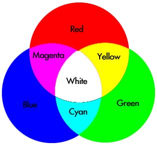
Because of this experience, I was very familiar with color wheels: red, blue, and yellow are primary colors, green, purple/violet, and orange are secondary, etc. However, when I took Physics my senior year of high school, I was thrown for a major loop: There was a different color wheel! Orange and Purple/Violet weren’t even mentioned; instead it was the Printer colors, cyan and magenta. Green was now a primary color and yellow was a mix of red and green. “Bizarre,” I thought. “If you mix green and red, you should get a nasty brown color, not yellow.”

It took me a couple days, but I finally grasped that we were talking about light, not pigments. And that’s how the color wheels were divided up in my mind until I read more of Albers’s book yesterday; I now know that they can be referred to as additive or subtractive mixtures, also known as direct or indirect mixtures or projected or reflected light.

To add further confusion, the images seen here can be viewed as both; if you connect your computer to a projector and show the images on a screen, both images will be projected light, even the one that is representative of reflected light. The opposite can also be said if you were to print these images onto paper; they would both be reflected light, despite the fact that one represents projected light.

Albers concludes his chapter on Factual Mixtures, Chapter X, by saying that additive mixtures (direct/projected) will get lighter and more white by adding more colors, whereas subtractive mixtures (indirect/reflective) will lose light and approach blackness by adding more colors.

It seems that knowledge of multiple color wheels and the way that direct mixtures compare to indirect mixtures is one of the key concepts – or perhaps even the key concept – about color for the aspiring designer, physicist, and the average citizen.

The Physics Color Wheel aka Additive Mixture aka Direct Mixture aka Projected Light (Top Image): http://www.d.umn.edu/~mharvey/colorwheel.jpg

A Standard Color Wheel aka Subtractive Mixture aka Indirect Mixture aka Reflected Light (Lower Image): http://jbrowngraphics.com/images/Justin%20Brown_Color%20Wheel.jpg

Monday, November 9, 2009

The Most Relative Medium in Art

Last night, a couple friends and I, including my “colorblind” roommate, had a highly intriguing conversation; this is doubly so because it relates directly to what I’ve been reading in Josef Albers’s Interaction of Color.* In the first few pages of his book, Albers says that “color is the most relative medium in art.” Last night’s conversation was one of those spontaneous philosophical talks that nobody can quite remember how it began, but which everyone enjoyed. I think… I did anyway…


Nonetheless, color was brought up and my roommate said that you had to look at the object in question** “through (his) eyes.” The essence of the remainder of the discussion revolved around individual interpretations of colors. To paraphrase: “My version of Green, for example, might be completely different than yours, but because all my life I’ve been told that it is green, that’s the color I see when you say ‘green.’” This coincides with Albers’s opening statement that “If one says ‘Red’ (the name of a color) and there are 50 people listening, it can be expected that there will be 50 reds in their minds. And one can be sure that all these reds will be very different.” Who’s right?

That’s why color is “the most relative medium in art.”

*Gosh I love it when what I’m learning about is backed up by a non-academic example in everyday life!
**The object in question? See image: http://www.oppictures.com/singleimages/400/SAN83004_1_1.JPG

Saturday, October 31, 2009

Colorblind Tests

In a conversation a few weeks ago, it came up that my roommate is colorblind. After razzing him for a bit*, he showed me some of the “color-blind tests” that he originally failed (including some of those pictured here). So, for the past couple of weeks, there has been an ongoing discussion, typically including a string of bad jokes, of what it is like to be colorblind, or “suffering from a color vision deficiency,” if one wanted to be more accurate. Personally, I’ve always responded to color**, and it seems like having a “color vision deficiency” would be a serious setback for the aspiring 3-year-old artist/designer. I asked my roommate, though, and he said that it had never presented much of a problem for him – because markers and crayons and pencils all have their color written on them – but when it did, he ‘would focus on expressing the emotion of the work without worrying about the colors.’***


A few interesting facts about colorblindness: “99% of all colorblind people are not really color blind but color deficient” and “99% of all colorblind people are suffering from red-green color blindness.” However, this is not necessarily the same 99 percent. Also, about 8% of all men and 0.5% of all women are suffering from color-blindness (1). The most accurate colorblind test is the anomaloscope (2), but the most common type is the Ishihara Test, which is the type pictured here.


According to Wikipedia (3), the Ishihara Test was designed by “Dr. Shinobu Ishihara, a professor at the University of Tokyo, who first published his tests in 1917.” Basically, it is a series of colored plates covered by circular dot patterns that have the form of a numeral written in the center; the number is easily visible to a person with normal color vision (and good reading-glasses). Whether or not it was his intention, Dr. Ishihara not only designed a test for colorblindness, but also a near textbook example of many of the basic design and Gestalt principles: unity, grouping by color, negative space between the dots, proximity and varied repetition of the dots, emphasis on the different color(s), balance of the plate, dot patterns, rhythm, et cetera. Once again, design and science are working hand in hand…

* All in good fun, don’t worry. His feelings weren’t hurt.
** One example: there were a couple of years in junior high I would refer to colors as they appeared in my Prismacolor marker set: “That squash is ‘Yellow Orche,’” and “Your water bottle is ‘Peacock Blue.’”
*** And I totally paraphrased his quote. Dude, please don’t be offended…
(1) http://www.colblindor.com/2009/01/06/50-facts-about-color-blindness/
(2) It’s really kind of a cool tool, and if you have a few minutes, click on the link and follow the directions to see ‘how colorblind you are’: http://www.colblindor.com/rgb-anomaloscope-color-blindness-test/
(3) Enough said, right? Here’s the link anyway: http://en.wikipedia.org/wiki/Ishihara_color_test

Images:


Wednesday, October 28, 2009

Nelson Art Gallery: Part II

I had so much fun the first time, I just couldn’t stay away! Anyway…

“The needle is the woman’s plow, according to John Ruskin,” says Dr. Patricia Turner (1). However, she continues, “Toward the end of the twentieth century and into the twenty-first, the needle became the paintbrush for many African American women able to pursue aesthetic expression.” This appears to be the case with Avis Collins Robinson, whose quilts make up a large percentage of the exhibit; not only has she contributed pieces of her own work, she has lent the museum other quilts from her collection, including “Black Man Burden,” the quilt featured in the last blog.

My two personal favorite quilts in the exhibit, while not “authentic (2),” are certainly beautiful designs. I’ll try to cover the highlights: both “Piano Keys” (2009; 108” x 77”) and “My Mama is Dead” (2007; 108” x 87”) are made out of cotton corduroy, cotton batting, and muslin components. The corduroy provides its trademark texture (3) in more of an implied, or haptic,
sense than a visual one.

“Piano Keys” (4) is a highly colorful quilt, which is probably what drew my eye in the first place. It begins with blacks and blues at the top and transitions to yellows and golden-oranges – with a large section of reds, which serves as the focal point of the design – and begins to transition back, with a few strips of blue, red, and black, at the very bottom. The cotton-corduroy strips are hand-dyed which could be the reason for their vivid coloring.

“My Mama is Dead” (5) was created after the death of Annie Ruth Collins, a cancer researcher at the National Institute of Health and, I’m going out on a limb here, the mother of Avis Collins Robinson. The sharp, defined edges of the objects, the use of triangles, and the red accents against the black was reminiscent of Native American Indian artwork; the white background, along with the red and black color scheme, immediately brought to mind the art of the Inuit peoples. The quilt, if featured horizontally instead of vertically is very well balanced without being symmetrical.

(1) She was in the last blog, too. I’m quoting her from the writing about the exhibit found at the entrance to the museum.
(2) The “authentic” quilt reuses old materials to make a unified object that provides warmth. These ones don’t look like their main purpose is to provide warmth; they’re too big. But, like I said, they are very aesthetically pleasing.
(3) Having history in a ski-town I feel compelled to note that corduroy has also come to be associated with “groomers,” probably because properly groomed runs look like corduroy clothing.
(4) Once again, I couldn’t find a picture, so here’s a link: http://16freckles.wordpress.com/
(5) Same deal as with #4: http://subjectivecreativity.blogspot.com/2009/10/my-mama-is-dead.html

Tuesday, October 27, 2009

Nelson Art Gallery: Quilts of African American Women

In the introductory piece of literature at the entrance of the Nelson Art Gallery, Patricia A. Turner, Ph. D. (and author of Crafted Lives: Stories and Studies of African American Quilters) writes that “New fabric was a rare luxury reserved for garments; they reused clothing, bedding, and flour sacks for their quilts.” She is, of course, referring to the process of quilt-making by (in this case) African American women. However, upon briefly glancing around the room, very few of the quilts appear to be made out of any of these materials. Closer inspection yields that the quilts are in fact made out of scraps of material. Meticulously thought out and manicured scraps… Cotton was used in the majority of the quilts, along with corduroy and some silk. Some denim from of old Levi’s blue jeans was also used in some of the quilts; how much of a bummer would it be to sleep on a jeans pocket… You’d probably have great morning-face lines…

During my visit, one particular quilt did appear to be “authentic,” made completely out of reused materials for the sole purpose of keeping its owners warm. A look at the title, designers, and history of the piece confirmed my belief: titled “Black Man Burden,” and made circa 19th century by Hannah Wilcox, a sharecropper, and Lucy Wilcox, a slave, it’s made out of “workmen’s cotton twill pants, raw cotton batting, and feed sacks.” The info on “Black Man Burden” also says that it is 81 inches by 74 inches, but the quilt is hardly a rectangle. If anything, it is more of a trapezoid.

On one side of the quilt, there is no real the pattern or rhythm; bits and pieces of whatever material was at hand appear to be stitched haphazardly together. The other side, while better, is still not something one would expect to see on a four-poster bed; it is composed of vertical strips six to eight inches wide divided by color, mostly. Again though, this particular quilt was clearly not made with its aesthetic appeal as a priority. One could easily imagine it covering a fieldworker or slave sleeping on a cot.

Even the most beautiful quilts often emphasize the whole over the parts – resulting in the absence of a focal point – and “Black Man Burden,” while not beautiful in the common sense of the word, continues with this tradition. Based on the small rips in the quilt, though, my guess is that the quilt’s point of focus was centered directly underneath*, at least until they hung it up in the Nelson.

*During sleep, in case you didn’t get that…

Side Note: I was unable to copy a picture of this particular quilt online. However, another blogger has a picture because we happened to be blogging about the same exact thing. Bizarre...
Here's the link:
http://de-signandi-natura.blogspot.com/2009/10/african-american-quilting.html

Sunday, October 25, 2009

2- and 3-D Designs

The first three dimensions are height, width, and depth. Designs can be either 2-D or 3-D, although any 3-D designs pictured on your computer monitor (or a paper printout, if that’s what floats your boat) will be 2 dimensional representations of a 3 dimensional design. Or it’s a 2-D representation of what a 3-D design could potentially look like, as is often the case with architecture software (hey, you can’t make a scale toothpick-model of every house that you’re hired to design. If you do, you should probably stop reading blogs and get back to work). Architecture software, such as AutoCAD (computer aided design or drafting), can help a person visualize what a building will look like and whether it is structurally sound (it probably does more, but I’m fairly unfamiliar with the program. Sorry).

The image to the right (1) is from AutoCAD (as if you couldn’t tell). The image, and other similar creations, provide a proportionate, scale-model view of how the building could appear, hypothetically.

However, as I mentioned, there are also 3-D designs. To see these, one really should travel to a museum. Or, for just a beautiful 3-D scene, good ol’ Mother Nature tends to do a good job. Regardless, one particular example of a 3-D design can be seen to the right and down a little bit in Lisa Hoke’s The Gravity of Color, New Britain (2008). Although the image does not provide the full “oomph” of 3-D design “in the flesh,” it does provide the essence. The pinwheel-esque color explosion is 30 feet high and covers parts of three walls; the focal point is the center of the wheel, where the colors meet, but the real draw of the design is its unity: proximity of the cups to one another, the continuation of the color outward, and the repetition of cups. The design, assembled onsite entirely out of plastic and paper cups (and screws and some paint), is slated to be held at the Connecticut New Britain Museum of American Art until 2010 (3).

(1) http://www.jtbworld.com/images/AutoCAD_2009_splash.jpg
(2) http://www.artinamericamagazine.com/files/2009/02/24/img-hoke_132030592636.jpg_standalone.jpg
(3) http://www.artinamericamagazine.com/reviews/lisa-hoke/

Saturday, October 24, 2009

Ukraine’s Got Talent Winner

The following video was sent to me a few days ago. It’s from Ukraine’s Got Talent 2009, which appears to be the same sort of reality TV contest show as other nations’ Got Talent programs. The artist, Kseniya Simonova, 24, began “sand animating” in 2008 when her business collapsed due to the credit crunch (1). According to the email message accompanying the video, the piece is about the German Third Reich conquering Ukraine in World War II. The quote on the final scene translates to “You are always near.” That’s should be enough background information.

Anyone who’s worked with sand knows that it’s not an easy material. If it is meant for images, as it is in the performance, it requires a three-dimensional medium to be viewed as a two-dimensional media. For Simonova to work so quickly, efficiently, and artfully, with a natural feel for showbiz (as seen when she throws sand to begin work on her next scene), it’s understandable why the judges awarded her with the win. One salient characteristic of the video is her development of faces, specifically the aging process on the woman. Her pictures are not abstract – though they do rely on negative space as the subject of the image – nor entirely realistic; if anything, they are symbolic representations of mourning women and war. The lighting beneath the sand also affords a sepia-tone look frequently observed in old television and video, and it works perfectly in sync with the subject material and images.

I encourage anyone reading this to take the eight-and-a-half minutes to watch the video and admire the skill, beauty, and talent in the art of Simonova, the reigning Champ of Ukraine’s Got Talent.

http://www.youtube.com/watch?v=518XP8prwZo

(1) http://en.wikipedia.org/wiki/Kseniya_Simonova

Tuesday, October 20, 2009

Humor

Humor is truly one of the finer arts to observe. It is also much easier to understand the concept of humor in the abstract than to actually partake in being funny.

To design a successful joke, one has to tell a story that builds tension, and then end the story in a way that releases tension in the form of laughter. The “story” can be only a few words long and very vague, such as the omnipresent “Why did the Chicken cross the road?” joke. The story is implied; the chicken, for some reason or another, was standing on one side of the road, and then it crossed. The tension is derived from the “Why,” and the answer, hopefully, releases the tension because it is something that is unexpected. Often, a joke’s “answer” is unexpected because it plays on conventional norms and would be inappropriate in any other circumstances; it exceeds boundaries.

Humor is often used in advertisements and Public Service Announcements. A funny ad that you talk about with friends is more likely to be remembered than a standard, “This is our product”-type ad. And, of course, the goal of any advertisement or PSA is to become imbedded in the subconscious of the viewer. Because of the easy access and set-up of accounts on websites like YouTube, the internet has allowed humor that would have been socially unacceptable in any other time period to flourish. Whether or not this is the beginning of a downward spiral in moral standards, or simply symbolic of how relaxed modern American and European culture has become “just as long as it’s funny,” is for the ‘experts’ to decide.

Here are a few humorous ads:

http://www.youtube.com/watch?v=8hFnUUzB218
Funny because it breaks a social norm.

http://www.youtube.com/watch?v=C50CWuRd_6U
Funny because it exaggerates an already exaggerated situation.

http://www.youtube.com/watch?v=a7nbmjkImHQFunny because it’s true…

Wednesday, October 14, 2009

Emoticons: The Death of the English Language?


Somewhere during the first season of the TV series, Californication, the main character, Hank – a professional writer – says, to paraphrase, “that ‘Emoticons’ are bringing about the death of the English language.” My gut feeling is inclined to agree. Who actually says, “laugh out loud?” Has anyone ever seen it in print other than LOL?* I can understand using “u” and “2” and “4” and “r” as abbreviations when you’re hurriedly trying to type out a text message, though they do seem childish and lazy. What I have trouble understanding is why anyone would use a colon and a parenthesis in conjunction to make a smiley face.** Who would design something so stupid? And how would one interpret it if they had never encountered the “winky-face” before? Supposedly, Abraham Lincoln is the first to have harnessed the power of emoticons, by making a ;) in his speech to signify a pause for laughs.***

Although frustrating to see the change, and the apparent loss of vocabulary, one (me, at least) can respect that emoticons are evolutionary – an innovation to the English language – and a new medium to express emotion. The English language has been continually evolving since the invention of the printing press around 1440 (Thank you, Herr Gutenberg); these days, one generally doesn’t see “Ye Olde Writingg Styl” except at “novelty” shops. Even “Thou and companie” has lost a large following. Meanwhile other words are constantly gaining and losing extra meanings and going in and out of style: bad, sick/ill, radical, dope, et cetera.

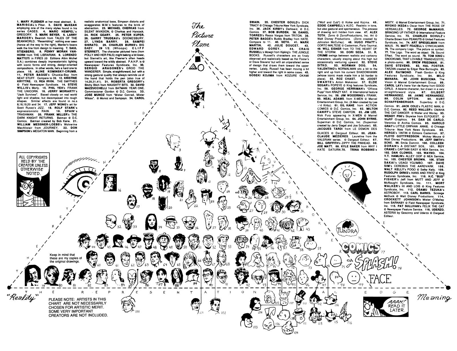
English-speakers, especially the newer generations who are being brought up with emoticons, are perhaps beginning to revert to using pictographic images as representations, just as the ancient Chinese and Egyptian cultures used; instead of representing things, though, emoticons represent emotions: happy, sad, ambivalent, surprised, and anger, among others. As Scott McCloud would put it, the English language is slowly creeping from ‘Meaning’ to ‘The Picture Plane;’ moving from many words working in concurrence as a description towards a place where symbols make up the greater part of what is written (see image (1)).

*You just did! Ha!

** The common use of emoticons has prompted most modern word processing software to automatically turn the combo into an actual smiley face for you.

***I heard this on Public Radio International’s “Wait, Wait, Don’t Tell Me,” so it should probably be taken with a grain of salt. Nonetheless, emoticons wouldn’t be Lincoln’s only idea that took years to be accepted, now would it?

Tuesday, October 13, 2009

Innovation: Bicycles


Living in a small, mountainous, resort town for most of my life has caused me to treat bicycles as tools for recreation and keeping up a standard fitness level. One generally doesn’t ride to school in three inches of snow…* However, my newfound proximity to the UC Davis campus has brought home the point that, yes, actually, bikes are an effective mode of transportation.

But how did bikes evolve to their current state? Answer: Innovation upon innovation; taking an old model, learning and understanding how it works, and then rebuilding it to be more efficient, more cost-effective, and – most importantly for the “stereotypical designer” – more fashionable.

A brief history of the bicycle: in 1817, the first machine resembling a modern bicycle was invented by Baron Karl von Drais in the forests of central Germany. “The bicycle was wooden with two wheels, a seat and handle bars” (1). By 1839 – a short series of evolutions later – the first modern bike was made by Kirkpatrick Macmillan. The father-son team of Pierre and Earnest Michaux – who were formerly credited with inventing the bicycle – designed the first pedal and gearing system in 1861. By the end of the decade, rubber tires were being used. The ‘Penny-Farthing’ bicycle (the one with the large front tire) was invented in 1870 by James Starley, and from there, the evolution into the modern day road and mountain bikes was fairly straightforward. An interesting tidbit: it was discovered in 1966 that a student of Leonardo Da Vinci had drafted plans for a bicycle as early as 1490, though the creative process halted there.

As was discussed in the last post, novelty doesn’t exist, so the only “original” ideas are based on old technology – essentially innovations. We build on the shoulders of giants. The most energy-efficient, effective mode of transportation –and the symbol for the city of Davis, California – was dreamed up in 1490, and then was redesigned hundreds of times to reach its current state. This process will continue for another 500 years because that’s how innovation works.
It will be fun to see how much my new favorite method of transportation has changed by then…

*In fact, one doesn’t necessarily go to school at all; “Dude, the powdah’s not gonna’ wait.”

1. http://library.thinkquest.org/J002670/past2.htm

Monday, October 12, 2009

Finding Inspiration Outside Oneself


The famous abstract painter, Jackson Pollack, once said, “Today painters do not have to go to a subject matter outside of themselves. Most modern painters work from a different source. They work from within” (1). However, if this statement is taken to be true, and is applied in conjunction with the fact that every human being since time began is different, then wouldn’t the “within” that is ‘worked from’ be singular, consistently turning out new, novel ideas? Novelty, though, doesn’t exist; it is impossible, at least according to the ancient Greek philosophers. Their assumption* was that “nothing comes out of nothing and nothing disappears into nothing” (2). Therefore, creators, designers, artists (and company), must look outside of themselves to find inspiration.**

Andrew Warhola, better known as Andy Warhol (1928-87), the “American painter, film-maker and author” has been called “the most contemporary of artists” (3). Best known for coining the phrase, “15 minutes of fame,” as well as his paintings/prints of Campbell’s Soup Cans (see image for just one example (6)), Marilyn Monroe, and Elvis Presley, Warhol “challenged preconceived notions about the nature of art and erased traditional distinctions between fine art and popular culture” (4). His paintings so clearly show where he got his ideas that it becomes almost comedic. For example: “I'd asked around 10 or 15 people for suggestions. Finally one lady friend asked the right question, 'Well, what do you love most?' That's how I started painting money” (5).


*And don’t get started on assuming. The ancient Greek philosophers can assume all they want; they’ve earned it.

Sunday, October 11, 2009

A Brief Rant About Art


According to Scott McCloud in his book, Understanding Comics: The Invisible Art, anything that’s not related to survival or reproduction is art (see the image). Design basically encompasses all art forms.

After re-reading the last post, where I used the terms “artwork” and “design,” almost interchangeably in some spots, to describe the pieces in the exhibit, there is something that I need to make clear: The ‘Typographic Exploration in Hangul’ has several great designs. Whether or not those designs are great art is something entirely different.

It seems that for art to be truly great, there should be the threat of impending danger when creating the piece – danger from a stray mark with a sharpie, or danger from a drip off the paint brush between pallet and paper, or danger from being crushed by heavy metal objects while welding. Many wise persons have mentioned that we learn more from our mistakes. When our mistakes are on the computer and easily erased and re-done, I’m not sure they count as mistakes. Unless of course you’re worried about the dangers of receiving a virus and your computer crashing. Seriously, though… Therefore, while digital prints are nice to look at and to have on your wall, in general, I’m not sure they can be considered great art.


Despite all this, the exhibit’s use of color, negative space, and the Korean alphabet to compose the images is well worth seeing.

Wednesday, October 7, 2009

Museum Exhibit: Hangul

The native script of Korea, known as Hangul, “was created in the mid-fifteenth century.” This is according to the flyer at the UC Davis Design Museum in Walker Hall (for more information about the museum visit http://designmuseum.ucdavis.edu/). There is currently an exhibit on the subject of Hangul featuring the work of two designers: Hyunju Lee and Phil Choo. Surprisingly, the exhibit is titled a ‘Typographic Exploration in Hangul.’ Very original.

However, unless an individual went into the museum expecting to decipher the characters, one would not necessarily know that the artwork – including Digital Prints on Archival Linen Cotton Canvas Paper and Inkjet Prints on both Canvas and Handmade Paper – could actually be read. The designers could’ve spelled out naughty words with full knowledge that the vast majority of people walking into the museum are there to see the artwork and are ignorant of the Hangul language. That could be very amusing…

One particular piece that has remained at the forefront of this blogger’s attentions since visiting the exhibit is known as ‘Dream of a Goose.’ It is a digital print representing the figure of a goose, complete with bill, head, long neck, and wings. These are represented in about three color swaths. Hangul symbols of varying size make up the rest of the color on the print, and provide the goose with life and motion. Standing back from the print, and holding prescription glasses away from one’s eyes, the goose looks like it’s flying down and landing on a lake.

Like many other works in the exhibit – including the other Digital Prints and the 3-D ‘Composition of Hangul Jamo’ – the aesthetic elegance of ‘Dream of a Goose’ relies heavily on the use of negative space. The negative space does exactly what it needs to for each image, forcing the colors to stand out vividly and give life to the image.

Perhaps because of the frequent use of negative space and/or the fact that most of the pictures were printed, the exhibit has a very modern/reserved/graphic-arts feel. In turn, many of the pieces, especially the two about laughter (“Haha Hoho”) and sadness (“Yuk Yuk”), look like they could be designs one might expect to see on t-shirts. And this is a good thing… we could all use another t-shirt.

Tuesday, October 6, 2009

Introduction

What is design? According to Answers.com, it is many things, including five definitions as a verb and nine as a noun. But is design limited to dictionary meanings, such as number 6: A basic scheme or pattern that affects and controls function or development: the overall design of an epic poem. (http://www.answers.com/design) Really, though, why does it matter what design means? Isn’t it enough that it is?

In many ways, design is like the air we breathe; it’s all around us, and we really couldn’t live without it. Architecture, the layout of your house or apartment, every logo and corporate ad you’ve ever seen, both cinema and theater (or theatre, if you’re really clever/European) wouldn’t exist without design, your clothing, your fridge, the way food looks… It goes on. And on.

The logical thing to do with topics as immense and/or confusing as design – including, but by no means limited to, space, life, death, luck, how to effectively use chopsticks, and whether or not the Loch Ness monster is real – is to ignore that they exist. Just keep living day-to-day life. However, when one can hold their breath no longer, and must take their head out of the sand, they should acknowledge the existence of these big issues. Then they should promptly subcategorize them: graphic design, interior, design, fashion, exhibition, architecture, appliance design…

In the following weeks, this blog will try and cover a small piece of the pie that is known as design. Good thing it’s a tasty pie…