Saturday, November 21, 2009

Fire Alarms

Where I live, we just recently had our seventh fire alarm (1) pulled in the past two months (2). So at four in the morning, when I was deciding if it was a prank or real and whether or not I needed to get out of bed (3), I thought to myself, “What could possibly make people want to pull the fire alarm so badly? And who the heck (4) would design such a terrible torture device?” The alarm turned out to be because of the faulty kitchen in the common area, again, but the questions stuck with me.

My guess for the first question is that the clearly printed words, “Pull Down” or “Push In, Pull Down,” working in conjunction with the color red, and the big, downward pointing arrows, have something to do with it (see images). Then again, it might be that tendency for kids in my age demographic to be self-destructive. As a good friend asked me last year, “Have you ever been driving and wanted to suddenly turn into the other lane (the one with oncoming traffic) as a car is coming?”

As for the second question, “Who designed the fire alarm?” the answer is Francis Robbins Upton, who did it in 1890 (5). It was not until the 1930s, though, that the smoke detector was (accidentally) invented by Walter Jaeger; smoke detectors and fire alarms tend to go hand in hand. By the late 1960s, fire alarms/smoke detectors were out on the commercial market, and are now present in about 93% of US homes and you are reportedly twice as likely to survive a house fire if you have one (same site as 5). I appreciate that fire alarms are here to save my life, but could they please do it sometime other than 4am?

(1) It might actually be eighth. My roommates and I are keeping a tally, but there’s a chance we all were gone when one happened.
(2) Yes, I do live in the dorms.
(3) You tend to get a bit jaded…
(4) You’re right…”heck” was not the word I was thinking at 4 in the am.
(5) I browsed the net for 20 minutes and his was the name that appeared most frequently. I would’ve preferred to use a book source, but alas, I have no books about fire alarms handy. Here’s the most helpful page: http://en.wikipedia.org/wiki/Smoke_detector

Top Fire Alarm Pull: http://ballyhooligan.files.wordpress.com/2009/04/fire_alarm.jpg

Bottom Fire Alarm Pull: http://www.firelite.com/images/bg12.jpg

Smoke Detector: http://www.smokedetectorsonline.com/images/smoke_detector.jpg

Wednesday, November 18, 2009

Nathan Shedroff

Today, Nathan Shedroff lectured at the UC Davis campus. I was in the audience (1).

He has a BS in Industrial Design, with a focus on Transportation Design, and an MBA in Sustainable Management. He has written several books, including Design is the Problem. He refers to himself as a “serial entrepreneur” and as “one of the pioneers in Experience Design, an approach to design that encompasses multiple senses and requirements and explores common characteristics in all media that make experiences successful, as well as related fields, Interaction Design and Information Design” (2).

Because of his background, much of his lecture was built around Sustainability. It used to be that an individual could operate singly in the fields of Design, Sustainability, or Business. Now, though, all three overlap with central aspects requiring ‘meaning and experience’ and ‘systems and services (3).’

Shedroff mirrored several of the tenets of Objectified, one of which was a statement that most of what’s been revered as great design is probably bad for the world. He also mentioned that Sustainability is a charged word, often associated with ‘Green’ (which he said one should try to avoid using); sustainable design (4) is just another way of saying, “Don’t design things today that make tomorrow worse.” He went on to describe what sustainability is by talking about Sustainability Principles, Frameworks, and Tools (all of which can be seen on the slideshow from his website (5)).

Shedroff’s parting words of advice were to, one, ‘learn as much as you can about sustainability,’ two, ‘apply it, but don’t sweat it’ – because, he said, about 70% of the environmental impact comes from the manufacturing side – and, three, ‘do what you can where you can.’ However, to wrap up this entry, I want to mention one point that resonated with me, as a design student: design is everywhere in society, as we’ve been “discussing (6),” and our society cannot function without design; according to Shedroff, “The future of design is business and the future of business is sustainability.” You do the math.

(1) Obviously. Or I probably wouldn’t be blogging about him now.
(2) http://nathan.com/me/index.html#biography
(3) His example was that the iPhone is popular at least in part because of the services that it provides.
(4) Sustainable design doesn’t technically exist, but there is such a thing as more sustainable design, according to Shedroff.
(5) http://nathan.com/thoughts/DesignIsTheProblem.pdf I especially recommend slides 5-7 and 31-32 which provide diagrams that explain the Then vs. Now concept and Sustainability, respectively. Basically, though, it was all worth looking at. Maybe if you don’t have enough time to watch Objectfied
(6) We haven’t really been discussing anything. I’ve been doing all of the talking – or writing, really – in this relationship, and if we’re going to stay together, then… just kidding. (Laugh out Loud)

Images are some of Nathan Shedroff’s examples of sustainable design:
Curitiba, Brazil’s above ground subway: http://citytransport.info/NotMine/U1997_0991a.jpg
Rickshaw Zero bag, designed for disassembly: http://www.treehugger.com/zero-waste-rickshaw-bag.jpg

Tuesday, November 17, 2009

Objectified

The documentary, Objectified, was released in March 2009, and is the second part of a “design-trilogy” directed and produced by Gary Hustwit. However, I would not have known that it did not stand alone if I had not looked online. “Objectified is a feature-length documentary about our complex relationship with manufactured objects and, by extension, the people who design them” (1).

When watching this film, I was immediately struck by the opening. Had I not known that it was a documentary, I might have guessed that it would be a drama or a quirky, independent-comedy. The film opens with the making of a modern chair by (mostly) machines. The camera placement – including odd angles, super close ups, and a clever use of zoom – provided some uniqueness to the montage scenes and was visually stimulating. As someone who has tinkered with filming and editing styles, I enjoyed the way that many of the edits fit together artistically as well as their usefulness for the sake of the ‘plot.’

Naturally, because it was a documentary, the majority of the feature was built around interviews. Because it was about design, most of the interviews were with successful designers. The visual component of the film shows the interview, the designer at work, or cuts to a montage, while simultaneously running audio from the interview. Usually the form lies in the images and the content comes from the dialogue, or series-of-intertwined-monologues, if you’re really specific…

To paraphrase some of the film’s key concepts,* almost everything that fills your world has been designed in one way or another, and most of what is designed will end up in landfills somewhere. A design speaks to who put it there and a good design reflects what it is. Designers can look at an object and think, “Why is it like that?” or they can ‘look into the future’ and design things that don’t yet exist. Sustainable design – which was one of the main focal points of the film – is becoming a requirement for modern designers because good design should be about being able to wear-in an object in as compared to just wearing it out. By putting great design into everyday things, the quality of people’s lives improves without them realizing it, which brings us to the central goal of design: to make people feel good.

It was not a movie that I would’ve checked out and watched on my own, but I enjoyed it and found it thought provoking… as is often the case with documentaries.** If you have a free hour and a half, I strongly recommend viewing it for yourself.


(1) http://www.objectifiedfilm.com/about/

*Unfortunately, while watching the video and frantically scribbling notes, I neglected to copy the names of the speakers, so I have a bunch of unattributed quotes on my paper and a separate list of all the ‘interviewees.’ If I accidentally quote one of them directly and they stumble across my blog, please leave a comment telling me and don’t sue me for the millions of dollars that I don’t have. Thanks.

**I’m thinking specifically of Andy Goldsworthy’s Rivers and Tides.

Image: http://www.bitique.co.uk/wp-content/uploads/objectified1.jpg

One of the topics covered in the film was the re-design of the hand-peeler. I thought it was appropriate to include this image as well: http://graphics8.nytimes.com/images/2009/05/08/arts/08objectified_600.jpg

Saturday, November 14, 2009

Trains

Yesterday I took the ‘Capital Corridor’ Amtrak line from Davis to Sacramento. It was the first time I’ve been on a train in, like, 15 years. Something like that. The ride itself was only 20-25 minutes long, considerably shorter than the wait, but it got me thinking. Trains are relatively fast, efficient if you have more than a handful of people riding, and far more comfortable than charter buses (which I had the pleasure of riding the rest of the way home for the weekend).

I’m not going to bore you with the long and involved history of trains; you can Wikipedia it yourself if you’re that interested.* Unfortunately, because trains are not exactly a great piece of art, I’m not going to be able to educate/fascinate you with the finer points of color theory or artsy vocab. Instead, I will try to briefly elaborate how trains are such an economical design in today’s world.

According to FactCheck.org – which had better be right – freight trains can transport one ton of freight 436 miles, or more, on a gallon of diesel fuel. “The average works out to be 435.88 ton-miles per gallon of fuel” (1). I can’t imagine that passenger trains would be much less efficient, despite having more frequent stops (acceleration, and therefore deceleration, is one of the greatest factors in a high gas mileage).

Now, I am an American and I do love the freedom that comes from driving myself from A to B in an automobile, but I think that in the environmentally conscious world that everyone keeps saying they want it would be a good idea to start riding trains again.** It might be a good idea to follow the more-or-less developed countries in Asia, Japan, and the European’s transportation model/design on this one. A lot of the infrastructure for a US rail-system is already built and Warren Buffett just recently expressed confidence in the railroads (2). Then he proceeded to invest $34 billion in RR operator Burlington Northern Santa Fe. Who says money doesn’t talk?

*Here’s the link, just in case: http://en.wikipedia.org/wiki/Train

(1) http://www.factcheck.org/askfactcheck/can_a_freight_train_really_move_a.html

**Hey, we did it lots last couple of centuries…

(2) I’m quoting from one of Steve Schaefer’s recent articles from Forbes.com. I actually read it in a magazine – *gasp* – so I don’t have the link handy. Sorry.

The image is the type of train I was on yesterday. Or, at least, it’s an Amtrak train, so it’s basically the same… Here’s the link: http://www.lightrailnow.org/images/amtrak-3-rivers-marysville-pa-20030916br_dave-kerr.jpg


Wednesday, November 11, 2009

Color: Factual Mixtures – Additive and Subtractive

I have been enrolled in art classes from a very young age. Or maybe it was just a relatively young age… Nonetheless, I’ve been in art classes for as long as I can remember.


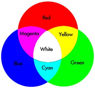
Because of this experience, I was very familiar with color wheels: red, blue, and yellow are primary colors, green, purple/violet, and orange are secondary, etc. However, when I took Physics my senior year of high school, I was thrown for a major loop: There was a different color wheel! Orange and Purple/Violet weren’t even mentioned; instead it was the Printer colors, cyan and magenta. Green was now a primary color and yellow was a mix of red and green. “Bizarre,” I thought. “If you mix green and red, you should get a nasty brown color, not yellow.”

It took me a couple days, but I finally grasped that we were talking about light, not pigments. And that’s how the color wheels were divided up in my mind until I read more of Albers’s book yesterday; I now know that they can be referred to as additive or subtractive mixtures, also known as direct or indirect mixtures or projected or reflected light.

To add further confusion, the images seen here can be viewed as both; if you connect your computer to a projector and show the images on a screen, both images will be projected light, even the one that is representative of reflected light. The opposite can also be said if you were to print these images onto paper; they would both be reflected light, despite the fact that one represents projected light.

Albers concludes his chapter on Factual Mixtures, Chapter X, by saying that additive mixtures (direct/projected) will get lighter and more white by adding more colors, whereas subtractive mixtures (indirect/reflective) will lose light and approach blackness by adding more colors.

It seems that knowledge of multiple color wheels and the way that direct mixtures compare to indirect mixtures is one of the key concepts – or perhaps even the key concept – about color for the aspiring designer, physicist, and the average citizen.

The Physics Color Wheel aka Additive Mixture aka Direct Mixture aka Projected Light (Top Image): http://www.d.umn.edu/~mharvey/colorwheel.jpg

A Standard Color Wheel aka Subtractive Mixture aka Indirect Mixture aka Reflected Light (Lower Image): http://jbrowngraphics.com/images/Justin%20Brown_Color%20Wheel.jpg

Monday, November 9, 2009

The Most Relative Medium in Art

Last night, a couple friends and I, including my “colorblind” roommate, had a highly intriguing conversation; this is doubly so because it relates directly to what I’ve been reading in Josef Albers’s Interaction of Color.* In the first few pages of his book, Albers says that “color is the most relative medium in art.” Last night’s conversation was one of those spontaneous philosophical talks that nobody can quite remember how it began, but which everyone enjoyed. I think… I did anyway…


Nonetheless, color was brought up and my roommate said that you had to look at the object in question** “through (his) eyes.” The essence of the remainder of the discussion revolved around individual interpretations of colors. To paraphrase: “My version of Green, for example, might be completely different than yours, but because all my life I’ve been told that it is green, that’s the color I see when you say ‘green.’” This coincides with Albers’s opening statement that “If one says ‘Red’ (the name of a color) and there are 50 people listening, it can be expected that there will be 50 reds in their minds. And one can be sure that all these reds will be very different.” Who’s right?

That’s why color is “the most relative medium in art.”

*Gosh I love it when what I’m learning about is backed up by a non-academic example in everyday life!
**The object in question? See image: http://www.oppictures.com/singleimages/400/SAN83004_1_1.JPG